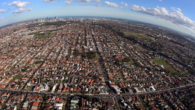
Showing posts with label population. Show all posts

Tuesday, August 18, 2020

Learning to live with less

Population growth has been a mantra of our property industry for as long as I can remember. And once again there are predictions of a surge in growth, driven (this time) by people allegedly fleeing Victoria. However, there are good reasons to think this may not happen, and that we may need to prepare for an extended period of minimal growth. This may not be a bad thing.

One of the first things to understand about our recent rates of actual and predicted future population growth is that they have been extraordinary in terms of the actual numbers and also in terms of the rate (speed) of growth. On a global scale, our forecast rates of population growth in major cities exceeded many leading world cities and was on a par with places like Shanghai and Beijing. In just 15 years, Brisbane, Sydney and Melbourne were predicted to grow by around a third – roughly three times the rate of growth of cities we often like to compare ourselves with like Copenhagen (for some reason), Los Angeles, San Francisco, London or Paris.


Given we started this forecast period with widely acknowledged urban infrastructure deficits (failing to keep up with population growth in the past), how we were supposed to not make the problem worse with these rates of growth is something smarter people than me might like to explain. Let’s just say the Chinese do things very differently so we can’t use Shanghai or Beijing as comparisons.

These predicted rates of growth were driven by three components: international migration (net overseas migration or ‘NOM’); interstate growth (net interstate migration or ‘NIM’) and natural growth (more births over deaths). And all three now look severely compromised by the policy responses intended to manage Covid.


In Queensland’s case, NOM has grown in importance in recent years, now accounting for more than a third of our population growth. However, with the closure of international borders, there’s been a virtual halt to 457 work visas, along with foreign student visas. Net overseas migration to Australia – Queensland included – will slow from record numbers to a trickle. This is likely to recover but unlikely to recover to pre-covid levels for some years: rising unemployment in Australia would not be helped by importing more labour on work visas. I cannot see a Federal Government supporting NOM at the same levels as we have seen in recent years when so many Australians themselves are out of work – something sadly that’s unlikely to change for a few years yet.

The rate of natural population increase is also significant, and typically stable. It has sat at around 30,000 per annum since 2016. There are two schools of thought here: lockdowns and work-from-home will lead to a post Covid baby boom (for obvious reasons) or that the post Covid recession will see fewer people plan on starting families until their financial futures are more certain. I can see a bit of both – an initial baby bump possible at year end after the March-April lockdowns, followed by a slowdown in births as the full implications of the recession sink in. In short, less growth from natural increases is my punt, for the foreseeable future.

The final source of population growth has been net interstate migration and this is where some are seeing hope of significant growth. The numbers of net interstate migrants to Queensland has been increasing since the 40 year lows recorded from 2010 to 2014, but will this continue?


There are a few things to keep in mind here. First, when NIM reached levels of 1,000 a week (around 50,000 per annum) in the late 1980s and early 1990s, Queensland’s total population was around 2.4 million. Today it is around 5 million. To have the same proportional impact, we would need to see NIM rise to around 80,000 per annum – and we are a very long way from that.

Second, there has been a close correlation between periods of high net interstate migration and periods of economic prosperity in Queensland. People did not come just for the weather or the lifestyle (attractive as these were) but they came in numbers when Queensland’s full-time jobs growth was strong, even stronger than NSW or Victoria.

There have been recent media reports speculating about Victorians (in particular) seeking refuge from Covid impacts in their home state and moving to Queensland. I don’t believe the media reports will reflect significant real numbers for the reason that Queensland’s full-time jobs growth has actually been negative in the last five years and anaemic in the last ten.


It’s important to look at full time jobs because these are the things people need to secure mortgages and to provide family security. Much has been made of the Gig economy, but part time and casual jobs are particularly vulnerable in recessions and especially to downturns in Covid-sensitive industries like hospitality, travel and tourism. Which happen to be synonymous with Queensland.

Would Victorians (for example) logically leave a state that has produced more full-time jobs than any other in the last five years for a state that now has fewer full-time jobs than five years ago? I have heard some in the property industry argue that if you had to be unemployed, where better than in Queensland. Which is true, but is this what we want? Migrants arriving without jobs to go to or limited prospects of getting any in the near term isn’t helpful. This won’t stimulate our economy but will add to the drain on services in costly areas for governments (meaning taxpayers) like health and education. Fewer full time employed taxpayers and a rising population of dependent unemployed is not a recipe for economic growth. Property professionals spouting this line need to take a long, cold shower. All population growth is not alike.

So each of three sources of population growth looks challenged in a post Covid Queensland, for the next few years at least. Less NOM, fewer NIM and less breeding.

Is this such a bad thing though? Provided we continue with infrastructure projects, it could allow the State to begin to close the infrastructure gap which has widened significantly in recent decades. The pressure is everywhere to see – rising congestion, hospital waiting lists, rising school class numbers, and hostility to development generally. If Covid forces a breather on the rapid rates of population growth we’ve been used to, perhaps it will mean we can actually enhance our quality of life and standards of amenity in the process?

It’s also worth keeping in mind that there are many global examples of low growth cities and regions which remain highly attractive and economically prosperous. The surplus of demand by people wanting to live and work there, relative to supply (deliberate limits on housing supply and population caps) invariably makes these very expensive real estate markets, completely unaffordable for many. But from a selfish property market point of view, they are still viable markets for development and redevelopment. Locally, think Noosa. Being horrendously expensive for residential or commercial property hasn’t stopped some of our other property markets before?


Thursday, August 2, 2018

How we lit the fuse on the population bomb


We’ve been here before – concerns about our capacity to house a large population are not new. But lately, hostility to rapid rates of population growth is gaining traction. There have been calls for a population enquiry and former PM Abbott has called for immigration (and hence population growth) to be slashed. He joins a chorus of other voices, from business to community groups. Voters are pushing back against growth and political leaders are feeling the pressure.


But these pressures are confined to mostly two cities: Melbourne and Sydney (and perhaps to a lesser extent Brisbane). There are other capitals and countless regional cities who covet growth but who find it eludes them. Instead, stupidly (it has to be said) we continue to cram accelerating population numbers – mostly driven by immigration – into a couple of urban centres. 

Melbourne was first settled by whites in 1835 and took 165 years to reach 2.5 million people (by the year 2000). Bernard Salt predicts the next 2.5 million will be added in just 21 years with the city reaching five million by 2021. He thinks it will sail past eight million by 2050. Sydney has a similar story.

According to the Productivity Commission’s 2016 Migrant Intake into Australia report, 86% of migrants settled in major capitals, compared with 65% of the Australian born population. More recent information suggests the trend has grown, with only 6% of recent migrants now settling in regions.

The Government has toyed with the idea of insisting that migrants settle regional areas where there are genuine labour shortages but there seems little determination to back the threats with action, which in itself could be difficult (and possibly illegal) to police.

Outsiders observing Australia’s handling of growth must be incredulous to learn that much of the concentration of growth has not occurred by accident, but is widely endorsed policy. Higher urban densities have since the late 1990s been at the core of urban development policy to handle population growth in the very cities now feeling the most resistance to growth. The benefits promised as a result of increased density were many and the public were assured that they would share in an improved quality of life as a result of these policies. Take this example from the 2013 Draft Metropolitan Strategy for Sydney to 2031:

“A home I can afford. Great transport connections. More jobs closer to where I live. Shorter commutes. The right type of home for my family. A park for the kids. Local schools, shops and hospitals. Livable neighbourhoods.”

And the result? For Sydney and Melbourne especially, housing affordability is as bad as the worst in the world with entire generations locked out of housing. Congestion is chronic. Private and public transport systems are under more pressure than ever. Commutes take longer and housing choice has been compromised. Is this livable? Talk about over promise and under deliver. If these promises had been borne out by the day to day experience of average Australians living in these cities, there wouldn’t be the push back politicians are feeling now.

Even more incredulous is that, confronted with the political challenge of an increasingly hostile public, some suggest (from the comfort of their high priced inner urban enclaves no doubt) that what’s needed is not change, but more of the same. The Planning Institute of Australia recently suggested as much, responding to a challenge from ABC interviewer Ellen Fanning on the 7.30 program that we are ill prepared to cope with “stuff(ing) another three and a half million people into Melbourne and Sydney both”.
The PIA responded that “We’ve got a great challenge to ensure that we don’t end with megacities like Lagos or Manila. We want Tokyos, Parises, and New Yorks – and we can do that by planning well.” (emphasis added).
Really? Tokyo, Paris and New York might be on our bucket list of cities to visit, but how many average Melbourne or Sydney residents would live in hope they’d one day see their own city turn into a version of Tokyo or New York? I can think of no public opinion poll where we Aussies have put up our hands to using Tokyo as a business model for urban development. Any politician suggesting as much would last a nano second before being turfed out.
It serves to illustrate how wide the disconnect has become between public policy makers and the wider community. The “we” word is used when the “I” pronoun is what’s really meant.
Maybe it’s time for a genuine reality check? I’ve always held the view Australia can readily support a larger population but in getting there, infrastructure standards need to keep up with growth, not continuously lag it. Housing and lifestyle choices don’t have to be further compromised to serve a model of urban development which is at odds with broader public opinion. The idea that much of this growth should continue to be concentrated in just a handful of cities already feeling considerable strain while other centres with infrastructure capacity and abundant, affordable housing find growth eluding them is plain crazy.
The answer I suspect is not in forcing people to settle cities and regions that are capable of absorbing growth but in making these cities and regions even more attractive as places to settle. Jobs, industry and economic growth lie at the centre of this. Positive economic attraction strategies, reduced tax or red tape burdens, abundant and low cost utilities (power, gas, water), ‘special economic zones’ – all are elements capable of attracting employers and industries, and with them jobs for workers and their families. And if regional employment was further supported by the type of place making and related infrastructure support more typically only on offer in the centres of major capital cities, there’s no reason at all that centres like Mackay, Armidale, Wagga Wagga, Orange, Casino, Bendigo and plenty of others can’t enjoy growth without the accompanying political pain.
Sadly, even this rather obvious policy option isn’t being explored. According to a recent report in the Sydney Morning Herald: “Inner-city centres on the east coast have amassed the greatest share of Australia's new public service jobs under the Coalition government as outer suburbs, bush towns and Canberra took cuts to their ranks of bureaucrats.” So we not only concentrate our population into a few centres but government jobs as well. This is hardly spreading the load or sharing the benefits.
Stopping growth by rapidly closing down immigration would be disastrous for industries which have come to rely on it but this is increasingly looking like it’s possible. But equally, persisting with our current approach will only further aggravate hostile electorates in the major cities, while electorates in centres with little growth could be equally cranky with governments for failing to produce growth where it’s wanted.  
The fuse on the population debate has been lit. And maybe we are the ones that lit it. 

Monday, June 11, 2018

Net interstate migration to Queensland is on the rise. Does this mean we are about to boom?


Positive net interstate migration to Queensland has in the past been a driver of growth for the Queensland economy. This is mainly because (contrary to popular opinion at the time) interstate migrants were not retirees but the average age was in fact around 35 – prime family stage of life, which is where household spending peaks. Many also arrived with ‘surplus’ capital (the arbitrage between higher house prices in places like Sydney and Melbourne compared with many Queensland locations) and they had well paid full time jobs to come to in Queensland. They were cashed up, fully employed and at peak spending stage of life. Happy days.

So is this about to happen again? Let’s hope so but before we get too carried away with some of the real estate marketing hype, here are some things to keep in mind...

The actual numbers are relative. 

Net interstate migration is now close to 20,000 per annum, almost double the prior year. That’s big growth in the short term. But it’s also a long way from the peak. In 1989 and again in 1993, that number nudged close to 50,000 per annum – or close to 1,000 people a week. Our population ticked over to 3 million in the early 1990s, so interstate migration back then was adding some 1.7% per annum to our population. 

But there are now 5 million Queenslanders. For net interstate migration to have a similar economic impact relative to the existing population, that 1.7% would today need to equate to 85,000 people per annum, or 1,600 people per week. So not only are we a long way from historic records, but to have the same impact, the growth bar has been lifted. The latest numbers that are being sold as good news are in fact less than a quarter of what they’d need to be to have a similar economic impact as it did in the early 1990s. 

The graph below shows the same thing but using the actual quarterly numbers from the ABS. This is what has people excited.


And the graph below shows those same quarterly numbers relative to the population at the time. Somewhat less exciting. 


Jobs. 

Growth in full time employment has a strong correlation with periods of high and growing net interstate migration, and periods of weakness in the full time jobs market has a similar relationship with periods of falling or weak net interstate migration to Queensland. 

The graph below selects periods of rising and high net interstate migration and periods of falling and weak interstate migration, and relates these to what was happening in the full time jobs market. I emphasise full time jobs as these are needed to fund things like mortgages or to have a substantial economic impact. Part time and casual jobs are counted in total employment data but for the purpose of this comparison, excluded. 


As the graph shows, in periods when Queensland’s full time jobs growth was stronger than or equal to rival states NSW and Victoria, net interstate migration was strong. It’s no coincidence that the strongest period of net interstate migration in both raw and relative terms was in that period of broadly 1983 to 1993, when Queensland was powering well ahead of NSW and Victoria on the full time jobs front. The next strongest period of net interstate migration (say 1998 to around 2003) also saw Queensland slightly outperform those states. Likewise, the weakest period of net interstate migration – say from roughly 2007 to now – also coincides with a period when NSW and Victoria have been outgunning Queensland on the full time jobs front. 

This seems to be convincing evidence that the relationship between full time jobs growth and net interstate migration is a strong one.   

What about house prices then?

My suggestion is simple: when you have a growing economy with growing full time jobs you are more likely to witness rising house prices due to demand side pressure (along with many other supply side factors having a bearing). Hence why prices have risen so much faster in places like Sydney and Melbourne in recent years, compared with Brisbane. 

The question is whether this gap in house prices will now become a trigger for large movements in interstate migration? Is the current increase in net interstate migration in response to this widening gap? The gap in median house prices has certainly widened to its widest point in some 15 years. 


It is tempting to think this is the case and for those who have bought into the Queensland property market it is hard to resist the idea that cashed up southerners will begin to flood north, underpinning Queensland markets and driving price growth even when southern markets are softening. 

However, the historic evidence seems to suggest that this is unlikely until Queensland’s relative strength in full time jobs is at least aligned with or ahead of full time jobs growth in NSW and Victoria. When that happens, and if the gap in house prices still remains, then it might be time to get excited. 

Monday, October 16, 2017

A new geography of urban wealth?


US based urbanist Richard Florida - once described as an “intellectual Rockstar” – shot to fame with his 2002 book The Creative Class. He was on a global speaking tour that took in many Australian cities, arguing that the secrets to economic development lay in attracting legions of creatively motivated progressives working in new economy professions. This was best done by enhancing inner urban “hipsterness” measured by a “bohemian index” with investments in public space, recreation, culture, and various other “urban chic” accoutrements. Many city leaders rushed for the Florida gospel, applying its preaching in the hope of out-hipping competing urban centres for precious jobs in the new economy. 

But Florida has since re-canted, admitting that the focus on inner urban “cool” may have worked for the wealthy and privileged but at the same time created city wide disadvantage. His latest book The New Urban Crisis suggests an alarming wealth divide is opening up between inner urban and suburban landscapes.

“Across nearly every metro area, middle-class neighborhoods are disappearing. Our cities and suburbs are being replaced by a patchwork metropolis, in which small areas of privilege are surrounded by vast swaths of poverty and disadvantage.  The rise of a winner-take-all-urbanism, with a small group of winners and a much larger span of losers, signals a profound crisis of today’s urbanized knowledge economy that threatens our economic future and way of life,” he now says. Talk about a change of heart.

While much of this may be true for major cities in the USA (where hipster havens like San Francisco or New York are losing millennials to lower cost of living centres in flyover country) is it also true for Australian cities? Are we seeing a concentration of wealth in inner urban suburbs while suburban areas languish? Certainly, the infrastructure and policy focus in most Australian cities has, for the past 15 years, been very much on enhanced inner urban amenity. But has this been enough to draw more high-income residents to the inner city and cause professionals to abandon the suburbs?

The evidence is revealing. Here’s a quick wrap of the picture across Australia’s capitals as of the 2016 Census.

Brisbane.


The household income difference between inner urban residents of Brisbane and those of the wider metro area have widened in the 2006-2016 period. Over that ten years, inner city residents (roughly within a 5 kilometre radius) have gone from enjoying incomes that were on average 13% higher than the wider metro average to now 23% more than the metro average. In dollar terms, inner Brisbane households earn on average $357 a week more than the metro average for the city.

However, the traditional patchwork quilt of high and low income suburbs remains a dominant feature. The suburb you live in still tends to define your household wealth status – be it high or low. Brisbane’s western suburbs (Fig Tree Pocket, Pinjarra Hills, Brookfield etc) are still among the highest income earners. South eastern suburbs (Carindale, Wakerley, Rochedale) are fast catching up. There are inner suburbs on the high income list (Bardon, Paddington, Bulimba etc) but there are others (like Kelvin Grove or Herston) which are well below the city wide average.

So while it is true the inner city is gentrifying, the preference among many high income households still appears to be for traditional suburban neighborhoods, many in middle to outer urban areas.

Sydney


Sydney is different. In 2006, household incomes in the Sydney city and inner south region were roughly the same as the wider metro average. By 2016 they were only 8% more. The North Sydney-Mossman inner city region actually went from being 56% more than the metro average to 37% more by 2016, while the Eastern suburbs north region stayed roughly the same – from 37% more to 38% more ten years later.

In dollar terms however, the differences are more stark: the average North Sydney-Mossman household in 2016 was pulling in $642 a week more than the metro average; and it was $667 a week more in the Eastern suburbs North.

So inner city residents of Sydney earn a lot more than the metro average in both dollar and percentage terms but it’s been that way for some time – hardly any surprise. This is entirely consistent with Sydney’s long term role as financial and business centre for Australia, which has arguably been the case for some decades now. Research would need to look back to the 1990s or earlier to find a turning point where inner urban income disparity began to widen significantly from the metro wide average – if indeed it did (or has it been so since the 1960s?)

However, proximity to the core does not preclude a number of middle and outer suburbs from joining the high income household list. Rouse Hill to the north west or Port Hacking to the south are two of several examples. In Sydney’s case, proximity to the core appears to have a significant relationship to high income households, but this has probably been the case since long before Florida published his first book.

Melbourne.


The household income gap in inner Melbourne compared with the greater Melbourne average widened from 5% more in 2006 to 10% more in 2016. The difference was greater in the Melbourne inner east area (14% more in 2016) but this was unchanged since 2006 (when it was 15%). In dollar terms, inner Melbourne households earn $155 more than the metro wide average and this rises to $213 a week more for the smaller Melbourne inner east area.

Overall, despite a widely reported acceleration of urban density programs in inner Melbourne over the past decade, this appears to have little impact on widening income disparity. In fact, it is possible to argue that Melbourne is more equitable in terms of inner urban versus wider metro household incomes than any other capital.

Melbourne also continues to exhibit a preference among high income households for a large number of middle and outer suburban areas. Any suggestion that high income professionals in Melbourne have abandoned the burbs for the inner city is not supported by the evidence.

Adelaide.


Households in Adelaide’s inner city (essentially its CBD) earned roughly 1% less than the metro average for the city in 2016 – which was down from 11% more in 2006. However, inner urban pockets such as Burnside inner (36% more in 2016) or Prospect-Walkerville (27% more in 2016) showed more disparity - but these differences seem for the most part unchanged since 2006 (when Burnside inner was 32% higher than the metro average and Prospect-Walkerville 19%).

So suburbs immediately adjoining the inner urban core of Adelaide appear to show more income differential compared with the metro average than the core itself, and these differences – 36% more in the case of Burnside – are substantial. But like Sydney, it would seem that this has been the case for at least the period since 2006 and there is no strong evidence of a widening income gap between inner and broader metro Adelaide - where the Adelaide Hills and foothills continue to be the preferred (suburban) environment for higher income households.

Perth


The gap between inner city household incomes and the wider metro area in Perth are widening – rising from 13% more in inner Perth in 2006 to 24% more in 2016. In dollar terms, inner city Perth households are now earning on average $386 a week more than the metro average for the city. At the time of the Census (August 2016) Perth was in the midst of a downturn in economic fortunes linked to the slowing resources sector.

You could speculate whether this had greater financial impact on inner urban or middle and outer urban households but without further study, this remains a topic of conjecture. For now at least, it remains the beachside suburbs north of the city that are home to the higher income households, much as it has long been.

So, what’s this all mean?

First, the Australian evidence runs contrary to suggestions that higher income professionals are abandoning the suburbs for “cooler, inner urban hipster” markets. Indeed, middle and suburban locations are where you are just as likely to find pockets of high income earning households (with the possible exception of Sydney where wealth does some more concentrated). The same, of course also applies to low income households but the point being that proximity to the core is not yet a key determinant for most cities – at least on the evidence. Larger homes and leafier environs remain for many a more powerful lure than higher density inner urban environments. There is evidence this may be changing and the gap widening, but the pace of change is not what some boosters have suggested. The suburbs have certainly not fallen from favour and remain very much desirable in the eyes of the higher income households that many inner urban markets covet.

It’s also fair to suggest that the income and wealth disparity Florida is now alerted to in cities like San Francisco and New York is of a scale that we are yet to see in Australian cities (again with the possible exception of Sydney). The enhancement of urban cores in many Australian city centres as so far mostly been insufficient to lure legions of high income creative class workers into those cores as places to live. Some will argue by pointing to anecdotal evidence (much of it owed to gushy headlines manufactured by eager boosters) but on the whole, Australian cities have avoided the problems that Florida now warns about.

For the time being at least.

Footnote: The maps used in this story came from a handy online tool published by The Guardian. You can have your own fun via this link.


Thursday, April 27, 2017

Does the world need a cure for living longer?


We are quick to celebrate advances in medical science which allow us as a species the opportunity to live longer. But the consequences of living longer are often glossed over. The economic consequence is that – worldwide – there are going to be more and more people in their old age relying on a smaller and smaller proportion of people of working (and taxpaying) age. It will affect different nations in different ways, so this is a quick wrap up based on the latest predictions from the United Nations population division.

The old age dependency ratio is a formula that expresses the population of people aged 65 and over as a proportion of those aged from 15 to 64. A rising ratio simply means that there are more people aged 65 plus relative to those aged 15 to 64. There is almost nowhere in the world this is falling. The world picture shows that we have gone from around 10% in the 1980s to one in four by 2050. Meaning that there was one person aged 65 plus for every 10 in 1980 but that this will change to one for every four in 2050. Those four will have to do the work that ten did in 1980, relative to supporting the 65 plus age group.


The rising dependency ratio is going to affect higher income nations with more developed economies to a much greater extent than lower income, less developed nations. The reason is pretty simple: wealthy nations can afford better health care and higher living standards. The difference is profound though – by 2050 high income nations will have a dependency ratio approaching 50%, compared with less than 10% for lower income nations. Will they be able to remain high income nations with this future burden? 


The continents that will be most affected broadly align with income status. The worst affected will be Europe, with a dependency ratio nudging 50% by 2050. North America is not far behind and Asia will be rapidly closing the gap.


Amongst the major European nations, Germany has a particularly nasty problem emerging on the forward radar – a dependency ratio of almost 60% by 2050. Little wonder German Chancellor Angela Merkel was so keen to attract such large numbers of refugee migrants (said to be more than 1 million in 2015 alone). France and the UK are following a similar pattern although with slightly lower dependency ratios and Russia only passes 30% in around 2045.


Closer to home, Japan is facing some serious problems. A forecast dependency ratio of 70% means there will be seven people aged 65+ for every ten aged 15 to 64. Japan’s dependency ratio is already problematic and this will get worse. China is also facing a rapid escalation in its dependency ratio which will rise quickly from around 2025, effectively almost doubling in the ensuing 25 years. I wrote about China’s people shortage (being a shortage of working age people) a couple of years back. You can click here to read it.


Australia itself shares a great deal in common with the USA and Canada in terms of our aged dependency ratio. We are currently in the midst of a significant increase which will see our dependency ratio rise from a fairly stable band of 15% to 20% from 1980 to 2010, to one in three by 2035. This will pose a range of budgetary challenges on both the income (tax) and expenditure (health and welfare) sides going forward.


The good news at least is that while we are increasingly better informed about the economic challenge of an ageing society, we are not ageing quite as fast as some places. Maybe we can observe closely how nations like Germany or Japan handle this escalating dependency challenge, and essentially copy the policies that seem to work best?

The bigger challenge is that further advances in medical science and disease prevention will mean these dependency ratios could in reality be much greater challenges in the future. Living to 100 might be commonplace for today’s millennials. Their children may expect to live to 120. But the question of how world economies – which were never designed for this demographic pattern – are going to afford to support societies where there will be nearly as many people aged 65 plus as there are of working age, is a big one and it’s unanswered.

Maybe in the future old age will no longer be an ambition but something for which we need a cure?

Tuesday, June 28, 2016

Why urbanisation is mostly a suburban phenomenon.


The world is rapidly urbanizing. The United Nations estimates that sometime around 2008, half the world’s population was urban, for the first time in human history. They estimate that by 2050 nearly two thirds of the world’s developing nation populations will be urban, while for the developed world, the figure will be a massive 86%. Australia fits this picture perfectly: some 80% of our population already lives in our major cities and half live in the three largest. But what’s not widely understood is that on both the global level and the Australian scale, this urban growth has been a suburban phenomenon.

This reality may come as a surprise to many and the cause might be in semantics. The term ‘urban’ has fallen into common use to describe higher density, inner city areas, while ‘suburban’ has typically been used to describe outlying areas of predominantly low density development (primarily housing). But when global statistics about urbanization are quoted, the meaning covers both inner and outer urban areas. Suburban is, after all, a subset of ‘urban.’

According to the MIT Center forAdvanced Urbanism: “While statistics demonstrate that the amount of the world population in metropolitan areas is rapidly increasing, rarely is it understood that the bulk of this growth occurs in the suburbanized peripheries of cities. Domestically, over 69% of all U.S. residents live in suburban areas; internationally, many other developed countries are predominately suburban, while many developing countries are rapidly suburbanizing as well… Suburbanization is a contemporary global phenomenon.”

The same is true for Australian cities. In terms of where we urbanized Aussies call home, for the vast majority it is suburbia. In Sydney for example, the proportion of people living within the prized 5 kilometre ring of the CBD is just 8%. A further 16% live between 5 and 10 kilometres from the CBD, a third live between 10 and 20 kilometres from  the CBD and 43% of people live beyond 20 kilometres from the CBD. Those proportions are broadly the same for other major capitals.  Rates of growth are similarly skewed to suburbia: despite some high rates of intense growth in inner areas, the broader metropolitan framework of our major cities continues to carry the bulk of the population growth workload.

What comes as an even greater surprise to many is that the bulk of jobs in our large metro regions are also suburban by location. The CBDs of Brisbane, Sydney and Melbourne account for 13%, 13% and 10% respectively of all jobs in their metropolitan areas. Adding in city fringe areas lifts this proportion to 19%, 15% and 14% respectively. This is an economic reality borne out by the Census but it doesn’t sit easily with much of our thinking about cities. Our perceptions and prejudices are formed by a concentration of media and planning debate on inner city areas. Impressive CBD skylines dominate news bulletins and vision of crowded commuters boarding mass transit lead us to conclude that this must be the norm for a majority of people. It isn’t.

The same is true of the United States. A recent article by Demographia’s Wendell Cox, writing in Joel Kotkin’s New Geography showed that, based on US Census Data, the CBDs of 52 major metropolitan areas contained 9.1% of jobs, and the inner rings a further 9.8% of jobs. “Early suburbs” (meaning those developed first in the history of urban growth) contained 44% of jobs while “later suburbs” and “exurbs” contained a further 37% of jobs. And in terms of jobs growth for the same 52 US metro areas in the period 2010 to 2014, CBDs accounted for 12.6% of growth, the inner ring a further 6.8% while suburban and exurban areas combined to create 80.6% of jobs growth. 

If the reality of suburbia is that it is the dominant housing and employment location for the majority of urbanites, it is also a reality that the changing economic landscape, enabled by rapid advances in technology, is going to continue to reshape both the suburban and inner urban landscape. There will always be a role for central business districts as the seats of government or as headquarters of large professional corporates, as well as centres for civic cultural investment, but the growing service sector and growth in new industries might increasingly exploit more accessible, lower cost suburban locations. There’s merit in this, as it may allow more people to live closer to their work, in more affordable locations. It may also prove cheaper from an infrastructure point of view, especially if car sharing and ride sharing and driverless technology begins to liberate us from the twin burdens of congestion and exorbitantly costly mass transit solutions designed around centralised centres of work.

This “new suburbanism” presents all manner of opportunities for economic development, productivity growth and property development. Identifying what those opportunities are and how to best capture them will require a new framework for thinking about what it means to be ‘urban’ and that thinking, I suspect, will increasingly turn to the suburban solution.

Tuesday, November 24, 2015

2016 is Census Year. But why do we bother?

Every five years Australia holds a census of its people and housing and next year it’s our turn again. The five yearly interval was introduced back in 1961 and it has over time become the essential reference point for demographers, economists, researchers, planners, governments and industry.  The last one in 2011 cost $440 million. It’s a small price to pay for such a high quality image of the reality of Australian society. So why are so many keen to ignore it?

Evidence geeks (myself included) love Census data because it’s almost impossible to refute. Myths and theories can whirl around in a drunken dance together with ideology and blind faith, but there’s nothing like a Census to bring them crashing to the floor with a sobering thud. It’s the indisputable authority on our people, housing and habits that make us Australian. On the evening of the 9th August 2016, wherever you are in Australia, as one of 24 million Australians and some 10 million dwellings, you will be counted and your demographic, economic, social, religious, education and transport profiles (to name just a few) will be taken.

And according to the Australian Bureau of Statistics “The 2016 Census will be Australia’s first Census where more than two thirds of Australia’s population (more than 15 million people) are expected to complete the Census online in August 2016. New delivery and collection procedures will make it easier to complete the Census online.” Which is going to be way more fun than an hour of Fruit Ninja, Subway Surfer or killing time on Snapchat.

Some more Census basics from the ABS Website: 

“In 2016, the ABS will:

  • Mail 13.5 million letters to households and establishments across Australia
  • Count all of Australia’s 10 million dwellings and 24 million people
  • Employ around 39,000 temporary field staff across a variety of roles, including up to 500 people to process the data
  • Scan paper forms as they arrive using industrial scanners operating 12 hours per day, 5 days per week, over 10 weeks, scanning close to 88 million pages
  • Produce and publish over 3 trillion cells of data as a result of the information collected in the Census.”

The level of detail provided by the census findings allows almost microscopic analysis of populated areas – down to groups of around 400 people (called a Statistical Area 1, or SA1). Combined with powerful GIS data mapping, the results can be displayed in a graphical way that is both intuitive and highly informative. 

But despite the best quality of data and the most advanced tools for interpreting and communicating that data, you can almost guarantee that sections of industry, media, think tanks and various lobby groups will either turn blind eyes to the findings, or find ways to contort the findings to suit their various agendas. 

Frustratingly, urban myths will persist despite the abundance of fresh, resolute data provided by the Census. Which makes you wonder why we bother with the expense and effort of gathering hard evidence only to find ourselves confounded by public policy which owes more to perception and prejudice. 

What are some of the myths that might prevail despite evidence to the contrary? Here are some nominations but we’ll have to wait until 2017 to see for sure:


  • The myth that all the jobs growth, and all the jobs, are in the inner city. The past several Census’ have stubbornly revealed that CBD and inner city shares of metro wide jobs are stuck at around 10% to 15% of the total, depending on the city. City centre jobs are growing, but so are suburban ones – and generally at least as fast if not faster. Some will ignore the relative balance between city centre and suburban market, and by only focussing on changes in the smaller city centre market, make distorted claims that appeal to kindred booster interests. Those claims get repeated without query, and the myths get a new lease of life.
  • The myth that millennials and Gen Y overwhelmingly favour apartment living in the inner city. There has been a very significant increase in the supply of new housing in the form of inner city apartments in the inter census period and there will be even more completed by August 9, 2016. The Census will reveal how much of that stock is occupied and by what types of households, and will prove an interesting reference point in the debate about the type of housing we are building, and for whom. 
  • The myth that families have turned away from the traditional suburban home. There have been numerous reports in recent years suggesting that young families have abandoned the ‘dream’ of a detached home with a backyard for the kids. I doubt this is true and suspect the Census might reveal how untrue this is. Sure, if you’re a young single or young couple with few ties and big city careers, the downtown loft is a lifestyle solution. But once children come along, or certainly by the stage they are ready for pre-school, my suspicion is that Census data will show young families still overwhelmingly choose the detached housing form in a suburban location. This is not to suggest there won’t be an increase in families being raised in apartment style living but I can’t see the scale of social change being predicted by some commentators being borne out by the evidence.
  • The myth that the traditional family model is dying. I know it’s de rigueur to talk about the growth of single person households, gay and lesbian couples (“not that there’s anything wrong with that”) increasing divorce rates and so on, but the Census is a reality check on what can become a runaway debate.  Unless I’m terribly mistaken, the idea of mating and producing children hasn’t suddenly gone out of fashion for the overwhelming majority of Australians. Much to the frustration of some social campaigners, I suspect the Census will reveal a stubbornly conservative majority still prevails. 
  • The myth that retirees are generally all wealthy boomers with money to burn. I know it’s an appealing thought, but I suspect the income data sets for seniors and retirees will paint a sobering picture of household incomes for this cohort. Assets are another thing of course and the Census doesn’t ask about assets like the value of the family home. But still, it’s cash flow that pays the grocery and other bills and most seniors, I suspect, will be shown to be on lower incomes than we’d like to think.

Why bother with the Census? Some will ignore it and others will twist its findings into all manner of statistical contortions to prove a theory they’ve decided to believe in, no matter what. But that doesn’t detract from the fact that it’s a terrific investment in the truth of what makes us tick. Bring on August 2016!

Friday, September 18, 2015

The world in the year 2100


In another 85 years, the world will be a very different place. Some nations are already shrinking and have much further to go, while others will grow dramatically. The world powers in economic and military strength are going to change. New stars will rise. Old stars will fade. So I thought it might be interesting to see how Australia might look by the year 2100, compared with some of our major trading partners or world powers.

Think how different the world was 100 years ago. The United Kingdom was an undisputed world power with a global empire that included Australia. The United States was not yet remotely a world power. Russia was still ruled by the Tsars, China was still a largely feudal empire and Japan was ruled by Emperors. From that period to now, the world population has risen by over 400%, with the fastest period of growth in the mid-1960s to 1970s.  Population growth in most advanced economies is now slowing to below replacement rate, with aging populations and fertility levels falling to less than half their 1960 levels. The clever people at the UN Population Division crunch the numbers on a regular and very detailed basis and their predictions in the past have been pretty much spot on. According to these experts, and assuming no Third World Wars or global pandemics, here’s a glimpse into the future…

 Australia’s population will rise from around 24 million now to about 33 million by 2050 and to 42 million by 2100. That might sound like a lot but an extra 20 million of us over the next 85 years is a minor statistical error in global terms, although given recent trends we could be a world stand out with 85 Prime Ministers in as many years.

What many people don’t seem to appreciate is that China’s population is at its virtual peak, and is about to start shrinking.  China will peak at around 1.415 billion people in 2030 and by 2050 there will be nearly 70 million less Chinese than at this peak. By 2100, there will be 372 million fewer Chinese than today and over 410 million less than the peak in 2030. They are also aging faster than their workforce can keep up with, although on the plus side, there is still plenty of room for productivity growth in China. Their current GDP Per capita is USD $7,500, compared to nearly USD $62,000 in Australia. (World Bank data).


Japan is forecast to have a steadily declining population. By 2050, it will have shrunk by 19 million people (that’s getting close to the current population of Australia) and by 2100 it will have shrunk by more than 43 million people. Those inflated real estate prices might be under pressure, which could do all sorts of things to the economy’s capital backing. They’re already reasonably productive and with a rapidly aging population, it looks like the land of setting – not rising – sun for them.  

Germany’s population is also in gradual decline. There will be roughly 5 million fewer Germans by 2050 and by 2100 there will be 17.5 million fewer Germans than today. All those empty beer halls! Little wonder the Germans are happy to accept large numbers of Syrian refugees – they have a highly productive economy but will have fewer people to keep it running.

India takes over from China as the world’s most populous nation within the next five years or so. By 2050 they will have added nearly 400 million more people. Their population peaks in 2070 at 1.75 billion (give or take an Australia or two) and declines to around 1.66 billion by 2100 – which is still some 355 million more than today. India has massive potential for productivity growth with a current GDP per capita of only USD $1,630 – which is 2.5% of Australia’s. They have a western democratic system of government but seem to have adopted the least efficient aspects of western bureaucracy with few of the benefits. If they can resolve their governance failings and modernise their economy, India may well be a new world super power by 2100. If you have kids in primary school today, maybe getting them to learn the Hindi language is not a bad idea. At least they’ll be able to follow all those Bollywood movies.

Our northern neighbour Indonesia has ten times Australia’s current population and this will rise by another 64 million by 2050. Their population will plateau from around 2060 and by 2100 will have decreased marginally from their 2065 peak to 313.6 million. Indonesia also has potential for productivity growth with a per capita GDP of only USD $3,500 but it’s not clear yet what is going to lift their economy nor how they are going to go about it.

Dear Old Blighty just keeps chugging along with its population steadily rising from todays 64 million to just over 75 million by 2050 and reaching 82.37 million by 2100. By this time there might be enough of them to field a decent rugby team. They’re a strong economy with per capita GDP of USD $45,600 but this is highly concentrated on London. Any glitch in London’s world financial HQ status could spell all sorts of problems in the future.

The United States will add another 100 million people by around 2070. (See my friend Joel Kotkin’s book ‘The Next 100 Million’ for what this mean for the USA.). Representing a third of the world’s economy, it’s difficult to see how the USA will lose any of its economic muscle over time. With a GDP per capita of $54,630, they just need their economy to begin firing again and for US consumers to open their wallets to stimulate rapid economic recovery – not just in the US but countries that rely on it. Another friend Dr Doug McTaggart has always maintained that the health of the US consumer has a far reaching impact on world economies and I for one believe him.

Do svidaniya comrades. Russia will shrink by 15 million people by 2050 and by 2100 will have shrunk by 26 million – equivalent to shrinking by a whole Australia today. But our Russian friends only let go of communism in relatively recent times and have much further to go in modernising their economy. They have abundant natural resources and with a per capita GDP of around USD $13,000 it isn’t hard to imagine the Russians still remaining an economic and military power by the turn of the next century.

The country that records the most astonishing growth over the period to 2100 is Nigeria. The forecasts are that the current population of 182 million will rise to over 398 million by 2050 – that’s double – and by 2100 will reach 753 million – which is almost double again and more than four times their current size. Many of the African nations show enormous growth over this period but Nigeria is the stand out. They have low productivity (per capita GDP USD $3,100) and often unstable systems of government. It’s difficult to see this being even a moderately prosperous future, unless those Nigerian loan scams are actually making a lot more money than anyone thought. The whole African story is something worthy of a lot more detailed study because that continent is going to continue growing at rates which far exceed the rest of the world. Something for another day.

What’s it all mean?

The only thing that’s certain is that the world economic order we know today is going to be vastly different in the future. Demography is going to play a significant part in that but, in reality, it’s impossible to predict much of anything beyond the likely population numbers. Will countries like Nigeria follow the Chinese path to rising economic prosperity, or fall further into poverty? Who knows? There’s another metric in all this which is aging and those countries with a younger demographic may well fare better than nations that find their relatively small working population struggling to support a much larger, dependent aged cohort. For nations like Japan, which is both shrinking and aging and with no immediately obvious path to lift economic output, this isn’t a pretty scenario.

And Australia? I think Donald Horne summed it up nicely in 1964: “Australia is a lucky country run mainly by second rate people who share its luck. It lives on other people's ideas, and, although its ordinary people are adaptable, most of its leaders (in all fields) so lack curiosity about the events that surround them that they are often taken by surprise.”