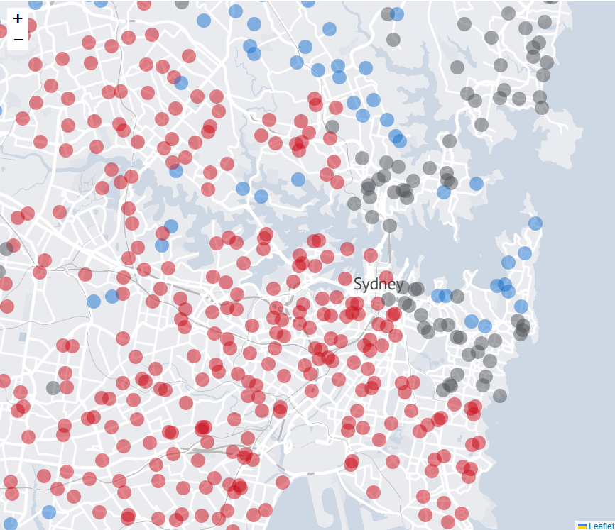
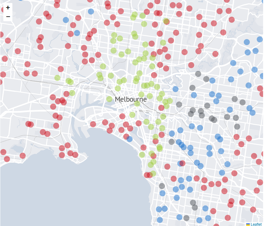
Monday, April 22, 2013

The demography of employment part 3: heading for a new class divide?


This third instalment of ‘The Demography of Employment’ looks at the different income profiles of city centre and suburban workers in Brisbane, Sydney and Melbourne. The results show some marked disparities based on geography, with the average CBD worker earning a quarter to a third more their average suburban counterpart. The top ten income areas city wide are nearly all inner city areas, and these workers earn more than double the average of the bottom 10 areas. Given that for every inner city worker there are around 7 or 8 suburban workers, the income divide between suburban worker and city worker becomes more stark.

The data referred to in this article has been extracted from Census data and prepared by the team at Urban Economics – an urban research company based in Brisbane. There are plenty of spread sheets to back up the statistics that follow so if you have further interest in this subject, I suggest you give them a call on (07) 3839 1400 or email Kerriane at kbonwick@urbaneconomics.com.au

In each of the three largest capital cities in Australia, the top ten income earning areas are mainly centred around the CBDs. Workers in central business districts areas earn on average between $80,000 and $90,000 each per annum. For working couples where both have city jobs, that’s a healthy household income of around $160,000 to $180,000 per annum.

Their suburban counterparts don’t fare so well. Average non CBD incomes are around $50,000 per annum. A working couple, on average, might bring home $100,000 per annum, a substantial $60,000 or even $80,000 less than their CBD worker counterpart. (These are just averages of course and good for order of magnitude comparisons only. It’s like the story of the economist who, with his feet in a bucket of ice and his head in a hot oven proclaimed ‘on average, I feel fine!’).

There are good reasons for this. CBD workers are likely to have higher standards of education and more saleable skills, working for businesses which pay a premium for talent in white collar industries such as finance, property and investment. Suburban employment typically leans more to retail and wholesale trades, and more blue collar industries where higher incomes are harder to earn. For areas in the suburban economy which are highly reliant on retail employment, for example, average incomes fall to around the mid to high $30,000s. Across all of our major metropolitan areas, there are many more people and families on these lower income levels than there are families where income earners enjoy inner city jobs and the pay packets that come with them.

Brisbane.

Highest average incomes in Brisbane are for jobs in the CBD, at $81,500 per annum. Second is inner city Newstead-Bowen Hills ($77,330) and third, Spring Hill ($75,880). But where the CBD and Spring Hill jobs are white collar knowledge workers and public servants (75%), there are only 35% of these types of workers in Bowen Hills, where 43% of jobs are blue collar. Adding to evidence that all high incomes aren’t always white collar are the Brisbane-Port Lytton area and the Brisbane Airport area, which are the 6th and 8th highest income areas in Brisbane with 74% and 62% of jobs classed as blue collar. But these are exceptions to the rule, with all other top ten income places taken by inner city areas.

Conversely, the bottom ten are nearly all outer suburban, led by Greenbank, then Caboolture, Taigum-Fitzgibbon, Robertson, Keperra, Victoria Point, North Ipswich, Carindale, Browns Plans and Shailer Park (incomes ranging from $33,710 to $37,770). The types of jobs are weighted more heavily to retail and wholesale trade, food and accommodation (roughly half of all jobs in these areas). Of interest is that even Taigum-Fitzgibbon and Keperra show a high percentage of white collar jobs for suburban areas (43%) but are still in the bottom ten. A white collar job it seems is in itself no guarantee of a good income.

Across the city, the average suburban job brings home $47,994 per annum while the average inner city job brings home 25% more at just over $60,000.


Sydney

North Sydney comes first for incomes across the Sydney region, at $93,410 per annum average. North and East Ryde are next ($89,570), followed by the CBD and Rocks ($89,210). At fourth and fifth place are the suburban employment centres Macquarie Park and West Pennant Hills. The latter has 80% of jobs in white collar positions but Macquarie Park is more evenly split between retail, wholesale and hospitality (29%) and white collar (54%) jobs. Further intensive development planned in this area will soon change these ratios.

Port and airport areas also feature in the top 10, with Port Botany ($75,560pa) and Banksmeadow ($75,210pa) showing that having 65% and 66% of jobs in blue collar roles is no barrier to a top 10 average income.

Sydney’s lowest income areas are around Bateau Bay, Roselands, Gorokan, Budgewoi, Casula, Cambridge Park, Umina, St Albans, Wyoming and Cabrammatta West, where average incomes range from $37,050 to $39,820 per annum. Here there are higher proportions of jobs in retail and wholesale trade (typically around 40% to 50%) but there are also reasonably high proportions of white collar jobs (mid-30%s to mid-40%s). Once again the evidence seems to say that a white collar job is no guarantee of a high income.
Across the Sydney metropolitan area, the average income of inner city workers was around $66,929 per annum and for their suburban counterparts, substantially less at $51,715 per annum.


Melbourne

Melbourne’s top ten income areas were almost all exclusively inner city, led by the Docklands ($87,300) a good way ahead of the CBD ($81,640). Then follow South Yarra, Southbank, Albert Park, East Melbourne, South Melbourne, West Melbourne and Abbotsford (the latter on an average of $70,250). Glen Iris – East is the only non-inner city area to make Melbourne’s top 10, coming in at number six ($76,300). All are largely white collar locations, with the exception on West Melbourne where 64% of jobs are blue collar and only 6% classified as white collar.

The lowest income areas across Melbourne are all outer areas, led by Taylors Lakes ($34,230) then Hoppers Crossing, Maribyrnong, Chirnside Park, Altona, Melton, Mill Park, Frankston, Meadow Heights and Mount Dandenong ($38,290). Altona Meadows and Frankston North show relatively high proportions of white collar jobs (46% each) which again is evidence that this is no guarantee of an area reporting higher average incomes.
Across the Melbourne metropolitan area, the average suburban worker earns $48,188 per annum, while their inner city counterpart brings home 24% more on $59,758 per annum.


Implications.

Earlier in this series we showed that suburban jobs outnumber city and inner city jobs by around 7 or 8 to one. We also know from the census results that inner city workers aren’t just in the minority by nature of location, but they are also in the minority by way of income. In both cases, it’s a case of being in a privileged minority: inner city workers earn on average a good deal more than their numerically superior suburban counterparts.

These averages aren’t always due simply to the nature of employment. Some suburban areas with relatively high levels of white collar employment are still featuring at the lower end of the income scale. Conversely, some areas with high proportions of blue collar employment also appear at the higher end of the income scale. (Mining, a non-urban industry is beyond the scope of this study but for the curious, the top 10 Australia wide areas for income are all mining regions, with incomes above $100,000 per annum).  So there are some grounds to suggest that location, as much as the nature of industry, has a significant bearing on income.

The evidence clearly shows that inner city areas have higher incomes. In many cases, considerably higher than suburban or outer suburban jobs. Our inner city areas are places of privilege in terms of the jobs they provide but also in terms of the riches of social infrastructure funded by the taxpayer. Heavily subsidised public transport networks are mainly designed to get inner city workers to and from their higher paying jobs. Taxpayer funded cultural, recreational and social infrastructure is concentrated in inner city areas, arguably where it is of more benefit (it is certainly more accessible) to inner city workers than residents of middle or outer suburban areas with suburban employment.

With so much intense discussion about urban growth and development typically focussed on what happens within a 5 kilometre radius of the CBD, it is fair to ask if this intense focus has diverted attention away from the needs of the majority of lower income (suburban) workers, to the benefit of the numerically smaller but considerably richer, inner city workers. The latter, based on the evidence, have a greater capacity to pay for the infrastructure they enjoy than the suburban worker and taxpayer.

This poses a challenge for policy makers and opinion leaders, many of whom are not only CBD or inner city workers themselves, but also residents of the inner city or near city areas. Living, working, shopping and pursuing high-end leisure pursuits in this privileged environment could lead to distorted views of the broader metropolitan economy. The CBDs and near city areas are seats of government and the headquarters of major companies. They are also typically where decision makers and opinion leaders in corporate life, public policy, the media, and industry groups live and circulate. It is easy to suspect that a good proportion of them don’t move much beyond these geographic confines.

I was reminded of this a couple of months ago when Prime Minister Julia Gillard decided to descend on the people of Rooty Hill, in Sydney’s west, hunting for votes. Following her went the Sunrise Show, the Today Show, and much of the press gallery. The footage I saw of them traipsing around Rooty Hill looking for ‘the real people’ reminded me of travellers in a strange land, encountering cultures and people quite alien to them. The people of Rooty Hill and western Sydney may well have breathed a sigh of relief when the circus left town a few days later. (Ironically, and in a classic display of how sad public policy making has become, the Prime Minister made some grand promises about an additional $1bn funding for a major highway upgrade to better connect the west to the CBD. This was despite the evidence which shows - though mustn’t have been consulted - that only a very small proportion of the people living there actually work in the Sydney CBD or its surrounds. The presumption seemed to be that Rooty Hill’s salvation lay in a better connection to the CBD. Asking the people of Sydney’s west what they really want may have revealed something else altogether).

The point here is that the income divide between city centre and suburban economies poses a challenge for policy makers. High income elites who work, live and circulate largely within a defined radius of the CBD could, unchecked, tend to dictate urban policy for the entire city, based on their limited perspective. We’ve seen elements of this surface in the disdain with which suburban ‘McMansions’ have been derided, or how the supposed ‘love affair’ suburban workers have with the private vehicle has been attacked.

It’s a fair question to ask whether the significant investments in inner city social infrastructure through urban renewal schemes, cycle ways, river and harbour side pedestrian walks, bicycle schemes, parks and gardens, cultural facilities and the rest have been balanced with equal emphasis on similar amenities for suburban employment centres.  

These inner city investments have largely relied on public policy support and taxpayer funds, but they have also leveraged private capital which has had the confidence to further invest in this environment. If a similar partnership could attract more private capital investment into suburban employment  areas, it could lead us in the direction of more significant economic benefit city wide, as opposed to concentrated benefit in the CBDs and inner city areas.

Next: transport and employment.

Thursday, March 21, 2013

The demography of employment part 2: where we work.


In part one of the Demography of Employment, we looked at the largely suburban nature of employment in Australia’s larger capital cities (Brisbane, Sydney and Melbourne). Typically, the CBDs and the adjoining inner city commercial areas account for only around 13% to 19% of all jobs across the metropolitan regions. Plus, this proportion hasn’t changed in the last decade, and in some cases suburban employment growth has outstripped the inner city. At least four out of five jobs, if not more, are in suburban locations – a fact that receives little attention in discussions about urban growth and planning.

This series tries to bring some more focus to the suburban heartlands of our economy. In this second part, we look at where these conglomerations of jobs are, and what this might say about some of the issues canvassed regularly in the media or in professional forums debating the growth of our cities.

In assembling this information, I am indebted to the team at Urban Economics – an urban research company based in Brisbane – who have methodically ploughed through the official statistics to help paint a picture of our suburban economy. If any of the material that follows leaves you wanting to know more, I suggest you give them a call on (07) 3839 1400 or email Kerriane at kbonwick@urbaneconomics.com.au

Brisbane.

The combined CBD and inner city areas of the Brisbane metro region accounts for around 170,000 jobs, or less than one in five of the region’s 925,000 jobs. The rest of the region’s jobs are dispersed throughout the metropolitan area. Some of this is a ‘salt and pepper’ scattering of jobs in largely dormitory areas, but there are also notable concentrations which, although they don’t in their own right challenge the CBD for its density of employment, constitute in themselves some very large concentrations of economic activity.

One of the largest of these is what we might loosely call the ‘Logan and freeway south’ area, which covers a large expanse of commercial activity to the city’s south and provides a combined 54,806 jobs. Put into perspective, that’s around a third of the CBD and inner city combined. The number of workers per square kilometre averages around 550 in this region, but rises to over 1,300 workers per square kilometre in Underwood.

Also to the south of the city lies a region we might call the south west and industrial – comprising areas like Pallara, Willawong, Carole Park, Wacol, Inala, Darra, Oxley, Jindalee and Seventeen Mile Rocks. This area is home to some 46,000 jobs, at an average of 460 jobs per square kilometre, rising to 1,200 jobs per square kilometre in Carole Park and with Wacol containing over 9,000 jobs alone. This area is roughly equivalent to just over a quarter of the employment in the CBD and inner city.

Other south side concentrations include the Mt Gravatt region with almost 36,000 jobs at an average of 809 jobs per square kilometre and rising to over 2,000 jobs per square kilometre in Upper Mt Gravatt (no doubt a reflection of the intense retail concentration here).

Plus there is a broad region around Beaudesert Rd (Yeronga, Moorooka, Rocklea, Acacia Ridge, Coopers Plains etc) with over 42,000 jobs at an average of just under 700 jobs per square kilometre and with more than 1000 per square kilometre in Rocklea-Acacia Ridge, and more than 1500 per sq.klm in Coopers Plains.

If you combined these four south side aggregations, and didn’t include the ‘salt and pepper’ scattering of jobs located in other areas on the Southside, you have over 179,000 jobs – which alone is more than the CBD and city fringe.

North of Brisbane there is a large area around Chermside which provides nearly 35,000 jobs. Chermside itself has over 3,500 jobs per square kilometre (most probably explained by its retail concentration) and the area itself over 1,400 jobs per sq.klm.

In addition, there are the northern arterial areas of Strathpine, Brendale, Albany Creek, Lawnton and the Hills District, which contain 21,697 jobs, and further north again are the Moreton Bay areas of Burpengary to Redcliffe which are home to just over 30,000 jobs.
These three north side areas combined account for some 86,000 jobs, or the equivalent of half of the CBD and inner city employment market.

Other aggregations throughout the metro region include the Redlands area (20,426 jobs) and the Trade Coast south area (38,000 jobs) and Trade Coast north area (33,346, including the airport).  Combined, there are 71,436 jobs in the Tradecoast area north and south of the river mouth.

Sydney

Sydney’s CBD is the base for 13.4% of jobs across metro Sydney. If we include Pyrmont, Ultimo, Potts Point and Woolloomooloo, this rises to just 15.6%.

Beyond the Sydney CBD and inner city lie some very large concentrations of employment – Parramatta perhaps being the most notable. The Parramatta Road area is the daily commute for some 118,182 workers. Not only is this a big number of jobs, but they are closely packed: overall worker density is 2,656 per sq.klm rising to over 5,000 per sq.klm in Parramatta-Rosehill itself.

To the south west of this area lies the western industrial employment region around Wetherill Park. This is home to a further 40,440 jobs.  And then to the north west of Parramatta lies the Blacktown and Hills district with a further 61,880 jobs.

Combined, these three western Sydney employment areas account for some 220,000 jobs. To help with context, this is roughly the same as the 250,000 jobs found in the Sydney CBD, Haymarket and Rocks area. And none of these figures include the ‘salt and pepper’ distribution of jobs found in nearby and adjoining pockets of land which are more residential in nature but which still include a significant number of jobs. For the sake of argument, it is fair to say more people call this large western area of Sydney a workplace than all the people who work in the CBD.

The Sydney north shore is an obviously large concentration of employment. North Sydney and Lavendar Bay have 43,000 jobs alone, at a workforce density of over 22,000 per square kilometre. So densely packed is this 1.9 square kilometre patch of land that it is in effect an extension of the CBD. Nearby are the other lower north shore areas which are home to a further 96,245 jobs. Not surprisingly they are also densely packed, with Macquarie Park at over 3600 per sq.klm, Chatswood at over 4,300 per sq.klm, and St Leonards at 9,364 jobs per sq.klm.

Other areas of metro Sydney which account for some significant numbers include the airport region (52,000 jobs), and the south west (including Bankstown) which is home to over 57,000 jobs.

But in Sydney’s case, nothing quite compares to the western suburbs employment lands for employment scale in terms of rivalling the CBD, albeit over a much larger area.

Melbourne.

The Melbourne CBD is home to only 10.6% of all jobs throughout the metro region. Include the inner city locations of Dockland and Southbank sees this rise to just 14.3% of the metro region’s jobs.

Melbourne’s economy beyond the CBD is perhaps more evenly dispersed than Sydney or Brisbane although there are clear concentrations in certain regions. Close to the city centre, Box Hill is home to over 17,000 workers and a workforce density of nearly 2,500 per square kilometre. Likewise, Footscray and Preston, also close the city centre, are home to over 12,000 and 16,000 workers respectively (at densities of nearly 2,500 and 1,500 workers per klm).  

Further out, the airport is home to over 40,000 jobs. The northern region (around Broadmeadows) houses 41,500 jobs, the western industrial region is home to just under 50,000, the Moorabin area is home to just under 30,000, the Bayswater area (including Ringwood and Croydon) is home to almost 45,000 and the north west outer areas of Bacchus Marsh, Melton, Sunbury south and Gisborne, home to over 16,500 jobs.

The bigger suburban employment districts though are both to the south east of the city.  Clayton (including Oakleigh-Huntingdale, Mulgrave, Mount Waverly and Springvale) is home to 77,761 workers at an average worker density of 1552 per sq.klm. In Clayton itself there are over 3000 workers per sq.klm. Also to the south east is Dandenong, including Hallam and Narre Warren, which is home to 71,684 workers, at a lower density of 853 per sq.klm. Put these two regions together and the number is a considerable 150,000 jobs. That is getting close to scale to the Melbourne CBD itself (186,000 jobs).

Implications?

These are big agglomerations of employment, spread over larger areas than the density found in the inner city, but undeniably large in their own right. Suggestions that outer suburban ‘sprawl’ will generate uncontrolled congestion as people try get to jobs in the inner city is simply not supported by the facts – because the scale and location of these suburban employment areas are generating more work commutes – at a factor of five to one – than the inner city.

Indeed, it may mean that further housing growth is needed on the outskirts to provide additional housing choice for people working in these areas. Increased housing density in inner city areas will find a market; but as a wholesale solution to housing across the metro regions of our capitals, it fails to provide choice in areas close to places where most people actually work.

It is also possible that a market for more diverse housing within and surrounding these employment areas is largely untapped, or even discouraged through planning schemes. Lower cost medium and higher density housing, along with detached housing, located in areas reasonably accessible to these employment areas, could be something for future planning schemes to consider.

A further implication is the need to consider increasing the allowable density of the employment lands. With many areas showing under 1,000 jobs per square kilometre, the efficiency of public infrastructure investment can tend to diminish. The very nature of many of the industries in these areas might prohibit higher density (eg warehousing and storage) but planning schemes which declare entire areas unsuitable for anything but light industrial or warehouse/storage might be denying a more efficient use of employment land and increased capital and social returns.

This also works on another level. It could make sense to allow more employment lands in largely dormitory residential areas. If the objective is to allow more choice and the opportunity for people to have shorter commutes, this notion of clear demarcation of housing and employment lands may need consideration. The entire western suburbs region of Brisbane, for example, has almost no employment, and workers have no choice but to clog the limited arterials out of their leafy dormitories in the daily trek to work.

Then there is the issue of transport: these suburban employment areas are not well served by public transport, nor can they be (we simply can’t afford it at present population levels). They are typically all in areas where private vehicle is the only practical choice for getting to and from work. Proponents of congestion charging, for example, may want to answer how their proposals could possibly impact on city wide congestion, other than to penalise the majority of a region’s workers (those with jobs in the suburbs) whose jobs are typically not flexible in choice of work hours and for whom a congestion charge would simply add to their cost of living without making any difference to their mode of transport.

Finally, is it valid to ask whether our planning schemes and infrastructure priorities have become distorted by an exaggerated focus on the needs of the CBDs and inner city regions? These are the seats of government and the headquarters of many large corporations, and also a cultural and social focus of our communities, so their primacy in many respects in justified. But equally, suburban employment regions which provide metropolitan and even state wide economic benefits at least equal to the CBD seem to receive comparatively little attention. To what extent, it seems fair to wonder, would our overall economic performance improve if the hard and soft infrastructure needs of these areas received equal emphasis by city planners?

Next: the types of jobs which keep most of us employed and the economy moving. 


Wednesday, February 13, 2013

The demography of employment part one: a suburban economy

Introduction.


Much of our debate about planning and urban growth in Australia is focussed on population, housing form and location. Small changes in household types and demographic trends at the margin preoccupy the minds of planners, the media, developers and policy makers. But the demographics of employment – a fundamental driver of demand – are by comparison little understood. Where are the jobs located? What types of employment trends in particular locations are having an impact on everything from housing demand to transport use? What sort of opportunities does this create and what are the challenges for public policy? Are some of our presumptions about the geographic distribution of employment wildly inaccurate?

This series of research articles has been prepared to shed some light on what I’d like to coin ‘the demography of employment.’ Much of the data is based on analysis of various ABS Census’ and I am indebted to the professional team at Urban Economics for providing this and for interrogating the Census findings so diligently. Other sources are noted where relevant. However the conclusions and observations are my own so if you want to obtain research related to your particular interests, please contact Kerrianne Bonwick at Urban Economics directly on 07 3839 1400.

I am also grateful to senior development and planning industry colleagues for their review of the draft and for their constructive comments.

Ross Elliott. February 2013.

Part 1: a suburban economy

A widespread impression exists in the mind of many from the general community through to the media, urban planners and even some senior policy makers that the city centres (‘central business districts’) of our capital cities are the biggest employers in our economy. Nightly news bulletins feature CBD skylines as backdrops. They are typically the headquarters of major companies and the seats of government. They are at the confluence of road and rail networks and feature a high concentration of infrastructure from recreation to cultural to social.

The reality, however, is that despite their profile, our CBDs account for a very small proportion of jobs in the economy. Census data for employment has its limitations but even with these limitations in mind, the evidence is emphatic: employment in our cities is overwhelmingly located in suburban locations.


Based on analysis of the ABS Census, in Sydney in 2011, the CBD accounted for only 8.3% of all jobs in New South Wales, and for only 13.4% of all jobs in wider metropolitan Sydney. Including the surrounding areas of Pyrmont, Ultimo, Potts Point, and Woolloomooloo raises this share to just 9.7% of all jobs in the state and 15.6% of jobs in metropolitan Sydney.

In Melbourne, the CBD is home to just 7.6% of the state’s total employment, and to just 10.6% of all jobs in greater Melbourne. Including the ‘fringe’ locations of Docklands and Southbank sees this share rise to only 10.3% of the state and 14.3% of greater Melbourne.

In Brisbane, the CBD share is just 5.8% of the state and 12.5% of the Brisbane region. Including South Brisbane, Fortitude Valley and Spring Hill raises this share to 8.8% of the state’s jobs and 18.8% of jobs across the Brisbane region.

Looking at it another way, in these major centres at least 9 out of 10 jobs state-wide are located outside the CBD/frame, and even across the metro region, about 5 out of 6 jobs are located in suburban locations as opposed to the centre.

This isn’t to say that the CBDs and their fringe commercial areas aren’t numerically large in terms of employment (they are). It simply means that their geographic dominance of our metropolitan wide employment distribution isn’t what many may have otherwise presumed. In other words, their share of the city wide jobs cake is a minority one.

If this is surprising, what will also come as a surprise is that in the past decade, suburban jobs have been growing as fast or faster than in the inner city, meaning that CBDs are only holding their share, or losing their share, to suburban employment. This has come about despite what has arguably been a decade or two of intensive debate and policy investment into our inner city locations.


For example, in 2001 the Brisbane CBD’s share of metro wide employment was 14.3%. Over the ten year period from 2001 to 2011, this share actually fell to 12.5%. Including the city fringe areas saw the ratio slip marginally from 19% to 18.8% over the same period, suggesting a leakage of sorts from the CBD to city fringe areas. CBD employment actually grew in that period by 18,793 jobs but what the data reveals is that suburban employment in the Brisbane metro grew faster and by much more – an increase of nearly a quarter of a million jobs across the Brisbane metro region compared with the 18,793 increase for the CBD.

In Sydney, the CBD and inner city areas accounted for 15.1% of jobs in greater Sydney in 2001. By 2011, this proportion had changed little to 15.6%. (Boundary changes by the ABS over the period make CBD-only comparisons difficult). An increase of more than 40,000 jobs in the city area over that time was dwarfed by the increase of more than 200,000 jobs across greater Sydney in the same period. Hence the ratio remained unchanged.

In Melbourne, the CBD share of metro wide employment was only 10.2% in 2001. Ten years later, it too had changed little, reaching only 10.6% (although a slightly larger boundary in 2011 would account for this increase). The inclusion of the Docklands and Southbank precincts over this period sees the ratios move from 12.1% of greater metro Melbourne jobs in 2001 to 14.3% by 2011 – a significant increase of sorts, which points to the impact of these new precincts on spatial employment patterns in Melbourne. But still, the combined areas of the Melbourne CBD, Docklands and Southbank account only for one in every seven jobs across the metropolitan region. Hardly a dominant position.

Finally the trend is not explained by the much promised transition to ‘telecommuting’ or ‘work from home’ occupations. Like many predicted widespread social changes, the reality doesn’t live up to the promise. ‘Work from home’ employment accounts for less than 5% of all jobs and this proportion has actually decreased since 1991.

Implications

For starters, if you think your bus or train to the CBD is more crowded, you’d be right. There are more jobs in the city centres now than 10 years ago - significantly more. But you’d likewise be correct if you were a suburban worker, grumbling that your suburban roads were now more congested. There are many times more jobs spread across suburban locations than there are in the city centre, and these jobs have increased numerically by much larger numbers (albeit spread over larger areas). And of course, if your commute to your suburban workplace takes you through an inner city road or transit node, you have a double whammy effect.

There are a number of quite significant public policy implications that suggest themselves based on this evidence. Public transport policy is just one. Our public transport systems are mostly based on a hub and spoke system (particularly for fixed routes as with rail) where the hub is the CBD and the spokes spread out. This system serves a highly centralised employment model but is notoriously inefficient (and prohibitively costly) when it comes to decentralised employment.

If typically our CBDs contain only 10% to 13% of broader metropolitan area jobs, even with unlimited budgets, the capacity to ever reach high proportions of overall public transit use are virtually non-existent simply because the networks will struggle to take people where their jobs are (overwhelmingly in the suburbs). This reality of employment distribution is something which receives very little prominence in public policy discussions about public transport investment; perhaps it should receive more? If only 10% to 14% of all jobs in the metro region are in the inner city areas, how can we ever expect to set targets much above that for public transit use? It’s a logical and mathematical improbability.

It also means that the billions of dollars needed to upgrade public transit systems will only ever be able to serve the minority of the working population whose jobs are in locations capable of being served by public transport, based on current distribution of employment and the nature of transport networks. And it means that the majority who use private transport to reach their suburban workplaces would be unrealistic to expect the scale of infrastructure investment needed to de-congest the suburban road network. Fixing this conundrum means either a massive re-centralisation of employment around the CBD or achieving rates of population density across urban areas of Australia that are more likely to be found in Asian centres. Neither of which will happen soon.

The other large, daily population movement around our cities, that of students, is obviously also very decentralised and thus not efficiently serviced by a CBD-centric transportation system. Plus, community wide changes of attitude about child safety have had a noticeable impact on the proportion of students who catch public transport, walk or cycle to school. by students.

There is no easy answer in this but setting unrealistic public policy targets for public transport systems in cities where employment is overwhelmingly suburban and not easily serviced, is setting ourselves up for public policy failure and community disappointment.

Another implication that flows from this spatial distribution of employment involves TODs (transit oriented development). The premise on which much TOD thinking is based is that creating housing options around transit nodes such as suburban train stations will allow people more convenient commutes to the inner city and hence relieve road congestion by lifting public transit patronage, among other promised benefits. There will no doubt be a proportion of the population for whom this is very appealing but given the low proportion of jobs actually located in CBDs compared with suburban locations, this level of demand is finite. Indeed, it may be that as well as creating higher density housing opportunities around suburban train stations in order for residents to commute into the city, we could equally consider creating higher density employment opportunities around suburban train stations, so that inner city residents could commute to suburban workplaces. Is it fair to suggest that to date, the emphasis on TOD planning has been largely on TODs as dormitory residential opportunities for inner city workers, and that this doesn’t align very neatly with the realities of the demography of employment? The evidence points to a broader land use mix for TODs than many have envisaged.

Another public policy implication is both planning and market based. Our CBDs are expensive places for businesses to operate from, but this higher cost base is offset against a number of locational and marketing conveniences along with amenity factors that CBDs have in their favour. However, steeply rising rents, combined with costly car parking may be pushing more employers out of these locations and into city fringe or suburban locations. The evidence is there to support this.

A number of our CBD offices command rents in excess of $800 per square metre per annum – more than the cost of quality office in downtown Manhattan, New York. Our CBD car parking costs have risen rapidly, partly due to punitive taxes designed to discourage city parking (as found in Sydney), partly due to planning limits on parking spaces in new developments, and also partly due to the balance of supply and demand. A study by Colliers International (Colliers International Global CBD Parking Rate Survey, 2011) shows that the daily cost of parking in Sydney and Melbourne are the 3rd and 4th most expensive of a series of world cities: more expensive than midtown Manhattan and more than London or Tokyo. Brisbane parking costs came in at number 14, ahead of midtown Manhattan or Paris. Suburban employment locations in our cities offer considerably lower accommodation costs and parking costs are negligible by comparison.

This high cost structure may be encouraging a decentralisation of employment away from CBDs. If this is true, this would mean that costs are pushing jobs into locations that are less well served by public transport. Suburban employment is efficiently served by the private vehicle while centralised jobs in high density CBDs are well served by public transit. Further public policy attempts to raise the cost of business in CBDs (such as cordon tolling - a vehicle tax on the inner city) may only have the effect of further decentralising employment and working against the very claims of its proponents (to encourage more public transport use).

Opportunities

There are possibly also opportunities in understanding the spatial distribution of employment in our major cities. If people want to live closer to their workplaces for example, is it not sensible to try to identify additional housing supply options near major suburban employment nodes? Inner city and CBD housing markets offer premium pricing and possibly concentrated demand but there is potential to oversupply demand in these. This is possibly what is happening in Melbourne now, and what has happened in other capitals in different parts of the cycle.

Planning regulations which typically favour housing density in inner city areas may need to be more flexible in the future if creating housing closer to places of employment is to be a reality.

It’s equally possible that the potential for employment land uses in suburban locations has been inadequately considered by policy makers. It is a complaint of many developers that access to suitably zoned employment land in suburban locations is constrained. Perhaps allowing more opportunities for this to happen would mean creating opportunities to take workplaces closer to peoples’ homes? The same could be said for major transit nodes. As noted earlier in this article, while these have traditionally been thought of as high density dormitory opportunities for inner city workers, the evidence suggests they may equally offer opportunities as high density employment locations for residents living along the network.

Conclusion.

We have collectively developed a fixation on our CBDs and inner city areas as economic drivers of employment. While they are very significant in size, they are not dominant relative to the spatial distribution of jobs throughout metropolitan areas. If the evidence is clearly pointing to cities with employment overwhelmingly located in suburban locations, and points to this trend continuing, it is possible that a variety of public policy settings could need resetting given the realities of our urban environment. It is equally possible that opportunities for growth and development to meet market demand for employment lands in suburban locations haven’t yet been fully captured.


Next: The nature of suburban employment

Saturday, November 24, 2012

Congestion.


We all hate it and there’s only one certainty about it: it’s going to get worse. In fact, I’d suggest it’s a mathematical inevitability. Things could be worse though: it could get better. Confused? Read on…

Nothing seems to infuriate the community at large more when it comes to urban growth than the consequence of rising traffic congestion. Getting to and from work and even shopping or recreational trips around the city on a weekend seem to take longer. We seem to spend more time stopped in queues of traffic waiting at traffic lights (often for two or three changes) before we move dutifully on to the next queue. Long-time residents recall fondly the days of easy mobility and, prodded by rising public annoyance, governments have rightly responded by approving new road initiatives to create more lane space.

In south east Queensland that’s meant the inner city bypass, the Gateway duplication, the Clem 7 tunnel, the Go Between Bridge, the Legacy Way Tunnel, and the M7 Airport Link - all of which have been green lighted with the intention of improving mobility around the city. With the exception of the ICB, nearly all of these have been initiatives of recent years, spurred initially by then Lord Mayoral Candidate (and now Premier) Campbell Newman’s ‘Trans Apex’ proposals. These won broad support at the polls from a community anxious for someone prepared to bite the bullet on doing something about congestion.

The ‘new ways not freeways’ brigade of flat-earthers, who had successfully scared off previous governments (witness the Goss & Beattie era opposition to virtually any new road projects), were out of favour.

But transport infrastructure investment wasn’t just limited to roadways for private transport. Billions have also been spent on busways and the bus fleet. Rail has been upgraded, and new lines are under construction south west to Springfield ($1.3bn) and north east to Kippa Ring $1.14 bn). Billions more have been proposed on public transport projects we really quite like the sound of but can’t afford. The $6 billion (or is it $7bn or $8bn?) cross river rail project is just one of those.

Yet despite this long overdue recapitalisation of our transport systems, congestion just seems to be getting worse. And there are very good reasons why it will continue to get worse. Why?

For starters, a city that grows is bound to experience more congestion. More people will equal more congestion. And when city plans are predicated on creating more urban density by increasing the number of people per square kilometre, congestion will get worse, faster. This is simple maths and it’s virtually impossible to deny. If there are ‘experts’ in urban planning trying to convince you otherwise, I’d suggest you think very carefully about the snake oil they’re trying to peddle.

The only way a city with rising density could avoid more congestion would be for every single extra person who is accommodated in a high or medium density dwelling to solely and exclusively rely on public transport, and not own or need a car, for anything. Either that, or we expand our road networks and public transport systems at a rate many times the scale of what we’ve already been doing, which we simply can’t afford (and indeed, just finding the space for the extra road lanes or rail lines is a physical impossibility in an already urbanised area, without going underground, which is massively expensive given our relatively small urban populations).

The reality is that even at the highest rates of public transport use on a global scale, you are not going to get more than half the population using public transport, or walking or cycling or staying at home. The other half will need and will use private transport and so will add to congestion.
But as targets go, 50% is well beyond the realm of possibility: it’s plain fanciful. This (50%) is the level of public transit in New York, famed for its subway system, mega density, and very large population (over 8 million). There are few cities like New York on the planet. And even by US standards, it’s unique in public transit patronage.

So for Australia, the most optimistic hope is that maybe, at the best, 30% of the extra population in higher density housing won’t need or depend on a private vehicle. That in turn means that roughly 70% will. So for every extra 10,000 people you add into existing urban areas under a density model, you will generate roughly 7,000 more people relying on something other than public transport to get around. Overwhelmingly that is the private car.  

You could always hope and pray that a high percentage of the existing population in established urban areas will swap their cars for public transport, alleviating road congestion in the process. You could also believe in Peter Pan. Here are a couple of neat little graphs which show long term patterns of public transport patronage in Australia.


(As an aside, the advocates of the “public transport will solve everything” school of thinking frequently resort to punitive public policy approaches such as congestion charging, parking levies, fuel taxes and other means in efforts to punish motorists for their chosen form of transport. The hope is that this will force people out of private transport into public. It won’t, it will only punish those in the economy for whom the private car is essential. This form of social engineering through pricing policy is worth another article in its own right, but not today).

Suburbanisation (‘sprawl’ to the ideologues) is also often blamed for rising congestion, the myth being that ‘all those people on the outskirts’ will want to commute into the CBD by car. But roughly 9 out of 10 jobs are actually in the suburbs already, so it fails the evidence and logic test to suggest that this can happen. The majority of jobs aren’t in the CBD, they’re spread throughout the urban and suburban network. Getting to and from most of those jobs requires a car, because public transport is so ineffective in serving cross-city commuters (though it works well for the minority who are CBD workers).

But rising density and a growing population alone aren’t the only factors that will increase congestion. Social change has played a huge part too, and trying to change society to solve congestion is something only Stalin might attempt. Consider the change in work in the last 50 years. The number of us working in centralised office ‘paper factories’ on rigid 9-5 hour shifts has declined. There are more dual income families, often with one part time job in the family. Employment has dispersed into various retail, industrial and service nodes throughout the urban fabric as the economy grew. Shopping for necessities is no longer a fortnightly or weekly trip, with stores open only Thursday night and Saturday morning (as they were). We now shop more frequently, often to or from work. We often have school pick up runs (something which I understand can add 20% to road traffic volumes in school terms), despite the availability of cheap, subsidised public transport for kids (partly because they’re spoiled and partly because as parents we’re scared of letting them out of our sight).

Modern life itself has made private transport much more the necessity. We aren’t as some suggest having ‘a love affair’ with our cars: we need them, and frequently more than one, just to operate at an employment and social level. Work, play, shop, live – all aspects of modern life are now more dependent on the private vehicle than they ever were.

Michael Matusik recently posted some interesting figures on this via his ‘Missive.’ Based on the census, “there are apparently about 7.8 million motor vehicles in Australia.  One in ten households does not own a car; two out of five (37%) dwellings hold just one vehicle, whilst a further 54% of our households own two or more cars. When it comes to those living in apartments, these proportions shift considerably: 14% of apartment dwellers don’t own a car; 52% only have one car and just a third own two or more cars, with 29% having just two cars.”

My take on this is that if overall car ownership is 90% of all households but still 86% of households in apartments own cars (albeit less of them), it isn’t really that much different. The form of housing choice is not highly correlated to a lesser level of car dependency. So changing the overall form of housing in society is unlikely to make much difference to our patterns of private vehicle use (and hence congestion). Modern society has more to do with it. 

So what can realistically be done about congestion? There is no silver bullet. We will continue to invest in new road transport networks as our city continues to grow, as we should. Likewise, we will continue to invest in more public transport, as we should. But as our city continues to grow and the economy develops, we will only at best be keeping pace. Our ability to invest at the speed required to decrease congestion is beyond our reach, and the potential of different forms of housing to alleviate congestion is limited, if it exists at all.

Increasing congestion will ultimately create opportunities for development in transit friendly locations which promise reduced congestion or travel times for residents and employees. This in itself won’t solve the broader issue, but simply allow some to respond to a market craving more convenience. To promise that town planning or public transport hold any genuine promise to substantially alleviate our great annoyance at other people using ‘our’ roads and slowing ‘us’ down, is to perpetuate a lie. 

There is one way congestion can improve, but maybe it’s the cure we don’t want. If congestion is a sign of an economy that’s alive with people making all manner of trips for work or social reasons, then quiet uncongested roads would surely be a sign of not very much happening at all. Think tumbleweeds blowing down the streets of your town. Empty shops and offices, abandoned factories, an empty CBD and a shrinking population. There are numerous US cities where this has happened to the city cores. There are also plenty of Australian towns and regional cities with a similar problem.

They no longer complain about congestion – they have more serious things to worry about. 

Monday, October 15, 2012

It's life Jim, but not as we know it.


A housing market recovery is now getting more airtime by the economic and real estate commentariat. Invariably, signs of life are almost exclusively referenced by movements in house prices. It’s reached the almost farcical point of minor monthly price movements making major headlines, on an almost daily basis, by the legion of analysts and data providers pouring over figures. But if life is returning to housing, are these commentators looking in the wrong place for the wrong thing?

The obsession with house prices as a general measure of housing market health is both misleading and quite unhelpful, but it doesn’t seem to stop even more commentators jumping the bandwagon. In part it’s understandable because the media will lap up content which its readers and viewers want to hear – and the ‘what’s my house worth’ motive is hard to deny. And the market commentators, working as most do for self-interest or corporate interest, are rewarded by the column centimetres and media airtime their house price comments attract. But as an indicator of general market health, these indices tell only part of the story, and for much of the industry, it’s not even the important part.

In the main, most price indices reflect movements in established housing stock, recorded by a differing range of methods. They do not indicate that prices per se are rising or falling, but that the halfway point of sales is rising or falling. In the market we’ve been through in recent years, the lack of interest in the top end of the market, compared with continuing turnover at the lower end, has seen the median pulled down. This has been widely interpreted as a general fall in prices (which have definitely occurred) but the extent to which the median price reflects real price movements is far from precise. Neither does the median price reflect anything in the way of market activity for new housing stock – sales of new detached houses, new vacant land sales, or new apartment sales. It’s a measure of second hand stock trading only, which is its second weakness. Further, movements in median prices on a month to month basis – as are now frequently reported – are ridiculously short term. Analysis even of annual movements is problematic but to read anything much into month to month median price movements, city by city, is taking it too far.

Another measure much loved by the media and some data producers are auction clearance rates. These don’t matter much in Queensland where very little actually sells by auction but even in Victoria and NSW where auctions are more accepted, clearance rates aren’t really a reflection of market health. You can have rising clearance rates on smaller volumes and in a falling market after all.

A final problem with our obsession with price indices is that rising prices are interpreted as good news. If you’re selling or an investor with multiple holdings, they are. But for new entrants they’re not. We’ve had an affordability problem of generational magnitude in this country for a decade now. Recent falls in prices, falls in interest rates and rising wages have helped close that gap. The last thing we really need now is for rapid price inflation and a return of a wider affordability gap.

So if median price movements or auction clearance rates which dominate media and industry commentary on the housing market aren’t really all that helpful, what is?

The answer I’d suggest is volume. Volume of activity indicates that buyers and sellers agree on pricing. It indicates confidence in the market, more so than micro movements in median pricing. It generates taxes for governments which right now desperately need them, allowing them in turn to spend, which the economy also needs. It’s like the blood in your body: things are much better when it’s flowing. You don’t need more but you have to worry when it stops.

The sort of volume indicators that will signal genuine signs of improvement for the housing market are things like housing approvals, housing commencements, the volume of new housing finance commitments, and the volumes of stock traded in the market – both new and second hand.

And when it comes to looking at the various volume indicators, month on month movements are just as flawed as they are for price movements. Look instead for 5 and 10 year trends and compare where we are now relative to previous peaks and troughs.  For example, the graph below shows home lending trends nationally since the 1991. (Full story here). The steady decline in owner occupier lending since the onset of the GFC puts us at generational lows, which can also suggest we have some significant upside once confidence returns. 

A similar graph, this from a recent UDIA bulletin (full story here) suggests things have been picking up in Queensland since early 2011 but also points to significant potential for improvement. A longer term time series would have helped put this into a clearer perspective.


Long term housing approval data tells a similar story. This chart by Macro Business’ ‘Unconventional Economist’ (full story here) was released early this year and shows long term data to the end of 2010. The subsequent fall in the Victorian market seems obvious now in retrospect. Reasons for optimism that activity will increase in the Queensland market, based on this long term trend, seem equally justified based on the historic perspective.

If volume indicators are perhaps the ones to watch, what are the things that might drive volume?

Falling interest rates clearly are starting to stimulate market interest. Further falls will hopefully trigger rising inquiry levels and greater volumes of market activity. Employment remains relatively strong and those with jobs have enjoyed, mainly, incomes that have kept pace with inflation (apart from rising utility costs and their impact on household budgets). Falling house prices have also helped close the affordability gap and stamp duty incentives on new construction and various planning policy undertakings in different states will help lower the delivery cost of new stock. All of this points to an improvement. Confidence in our national government and in our economic future remain significant brakes on enthusiasm but confidence can shift up or down quickly. Resolving the political impasse of our national government would help confidence immeasurably and that opportunity is coming increasingly closer.

But there’s one more ingredient which I don’t hear many people debate, and it’s neither economic nor political. It’s biological.

Consider for a moment the generation of people in their early twenties when the GFC first arrived. Housing prices were still rising (fast) and stories were everywhere about a generation happy to rent rather than buy – a generation that had ‘given up’ on ‘the dream of home ownership.’ That generation has been deferring that housing decision for what will next year be five years. If they were in their early twenties then, they’re in the late twenties now. If they were in their late twenties then, they’re in their early thirties now.

If they’re still living at home, or sharing a house with others, or renting some dive, they’re quite possibly over it by now. The longing to find a mate and to raise a family in a home of your own, much as it’s unfashionable to talk about in this age of gender neutrality and same sex couples, is as irresistible an urge as humanity itself.  The world population would not be growing if it weren't.

That compression of demand in recent years due to the deferment of decisions on family and housing must, at some point, decompress.

The hope is that this decompression when it happens leads to rising volumes of activity and rising new housing construction, and not simply to rising prices. The signs of life we should be looking for are those which point to just that. 

Saturday, September 15, 2012

Not waving, drowning.


The Queensland Government’s first budget attracted plenty of attention. Now, as the budget reaction settles, it could be time to turn attention to some of the non-budgetary measures which won’t cost the state anything but which have the potential to stimulate the economy quickly and start generating much needed cash flows and taxes in the economy.

The fiscal measures contained in the new LNP Government Budget have drawn an extraordinary amount of media and public attention. The reality of cutting costs though really shouldn’t have come as any surprise. Mr Micawber (from Dicken’s David Copperfield) knew the formula well:

"Annual income twenty pounds, annual expenditure nineteen pounds nineteen and six, result happiness. Annual income twenty pounds, annual expenditure twenty pounds ought and six, result misery."

The reality which seems to have been lost is simply that you can’t pay for public services (or public servants) unless there are sufficient taxes generated by the private sector to pay for it. You can’t have the public without the private. And the private sector in Queensland has been weakened – construction is down, confidence is down, tourism is down and agriculture has had a rough trot at the hands of some variable seasons (the latest being an exception).  The government either raises taxes or cuts costs. It did a bit of both.

Some industry groups had pressed for tax cuts, including in the property sector. As justified as lower taxes might be, I never really saw how this new government could deliver cuts given the economy and budget it inherited. They will hopefully come in future budgets but there are in the meantime plenty of things the government can now turn attention to, which won’t cost the budget but which will have just as big an impact on restoring confidence and stimulating the appetite for risk.

As I pointed out back in April (read it here) tax cuts alone are only a part of the solution. The bigger challenge in many ways will be to cut the excessive burdens of regulatory compliance which have so effectively stifled development in the property and tourism sectors – for nil apparent gain.

Red tape (or green tape as much of it is now called) has grown exponentially in the last decade and as it grew, the willingness to continue by those subject to it, diminished. Development activity (the supply of new houses and apartments, the creation of new retail infrastructure or the creation of new tourism assets) has reached a generational low.

(I always thought the colour coding approach adopted by bureaucracies is an insight into where it all leads: a ‘green paper’ gets drafted for comment which later turns into a ‘white paper’ and this then turns itself into ‘red tape’ which leads us all into a ‘black hole.’ You see, it’s easy once you understand the process!)

Here’s one example. The current ‘Sustainable Planning Act’ in Queensland runs to nearly 750 pages. That doesn’t include any number of consequential regulations or referral legislation. Quite a page count! (I’m told the brag by some members of the previous government was that a KPI of the Sustainable Planning Act was that the word ‘sustainable’ appeared on nearly every page. Sustain-a-babble more like it).  By contrast, the Local Government (Planning and Environment) Act of the 1990s ran to 170 pages.  So we now allegedly need 750 pages of legislation to do what 170 pages used to accomplish at less cost, faster and with more certainty 15 years ago. Are the outcomes today any better? No. So what was the point?

The same story could be repeated across any number of local governments whose planning administrations have grown exponentially in that time, delivering in the process only the same outcomes but costing vastly more and taking a great deal longer and with a good deal less certainty. (I wonder on that score how the nearly 300 staff of the Sunshine Coast Council ‘planning directorate’ are faring? They would be immune from State Budget cuts but surely something will have to happen… having more planners per head of population than doctors is a sign that things aren’t so sunny on the Sunny Coast).

Some simple observations point to the extent of over exuberant regulatory controls. For example, why is building a residential house in a residential area now subject to a costly and lengthy development assessment process with the local council? Why does this simple act of building a house invite people to ‘Have Your Say’? Surely the relevant building or design codes are enough. If neighbours don’t like the architectural style of the house you want to build on your property, it’s none of their damn business, provided it meets code guidelines. Private certification, not assessment teams at the Council, should be all the process required.

It used to be that the simple question of ‘what can I do on that particular block of land’ was answered in a pretty straightforward way. Now, it all depends – it depends on what ideas you have, it depends on how the regulatory planners and local politicians feel about those ideas, it depends on how tenacious you are in pressing for the most permissive approvals possible, it depends on what your neighbours think, it depends on what any number of other government departments think, it depends on what the green movement thinks, and it can also depend on what the local media think. Get all those unknowns lined up, and you can get moving. 

All that the additional regulation has done is create more ambiguity. More words equal less clarity. My suggestion to the government and to local councils is to dust off the planning laws of 20 years ago, give them a modern title and use that as a starting point.

If clarity is one objective we should aim for with less red tape, so too is flexibility. That may sound counter-intuitive but it doesn’t need to be. Planning laws can be more specific about the types of outcomes they will support in certain locations. For example, converting standard detached residential to small lot housing for seniors in areas surrounding shopping centres seems a no-brainer.

So too does encouraging an expansion of competition in the retail sector. The dominance of Woolworths and Coles and of shopping centre owners under ‘centres policy’ has created a significant barrier for entry for new retail businesses. Aldi, for example, is on the record for targeting Victoria for expansion because its planning laws are superior to Queensland. Having some of the highest retail rents in the world is not a good thing, and more competition in retail by allowing more retail space to be created outside the existing rigid footprints is one way to fix it.

And when it comes to flexibility, let’s tackle the iron clad provisions of the unworkable South East Queensland Regional Plan. The flawed maths behind the targets of the SEQ Regional Plan have been covered before, but there’s also the nonsense of a rigid urban boundary, one side of which allows development, while the other preserves historic uses. This ultimately comes down to one side of the street or another. Inside that boundary, competition (demand) for land rises (as do costs) due to the artificial scarcity imposed; outside the boundary land is arguably undervalued and under-utilised.

There have already been some alarmists warning of environmental doomsday if this were to change (read a few of them here) but change it has to. There can still be some general intention of an urban boundary but maybe rather than using a thin black regulatory line, try some very pale watercolours instead, so that the transition zones are bit less defined? This could even appeal to the advanced finger painting set which have colour coded pretty much every parcel of land in Queensland according to rigid land use thinking. Now they can do it all again but with water colours?

Improvements though are starting to happen. Recently, COAG released a good report on Housing Supply and Affordability Reform (well worth a read, click here if you’re interested) and last week, Deputy Premier and Planning Minister Jeff Seeney announced some initial moves to reform planning legislation. (View it here in case you missed it amongst all the budget noise).

But most encouraging for me was getting a phone call from someone in an office of regulatory reform (can’t recall the exact title) who was doing some homework for the Queensland Government on regulatory overkill. He had read the recent Pulse on tourism and was looking for some case studies. We had a good chat and I pointed him in the direction of a few people with some pretty sorrowful stories to tell, and even shared my own frustration at the banning of septic tanks and how even going to the toilet has now become a costly victim of regulatory overkill and a disincentive for micro tourism development.

Maybe it’s a sign?